If you’ve ever walked into a small room and thought, “Wow, it feels so open in here,” chances are it wasn’t because of the size — it was the colour. Colour has a remarkable power to change how we perceive space. The right shades can make rooms feel airier, taller, and more inviting, while the wrong ones can leave even a large space feeling cramped and gloomy.
Whether you’re decorating a tiny apartment, updating a dark living room, or simply chasing that fresh, sunlit vibe, mastering the art of colour choice can completely transform how your home feels — without moving a single wall.
Why Colour Changes How We See Space
Colour influences perception because of how light interacts with it. Lighter shades reflect more light, making a room feel open and expansive. Darker tones, by contrast, absorb light, which can make a space feel smaller or more enclosed — though not always in a bad way (a darker palette can add drama and intimacy when done right).
That’s why designers often start with the foundation elements — walls, ceilings, and floors — when trying to create the illusion of space. The colour of your flooring, in particular, has a huge impact on the overall brightness of a room. A coat of polyurethane floor paints in a pale, light-reflective tone can make floors look fresh and modern while helping light bounce around the space more evenly. It’s a trick often used in Scandinavian and coastal interiors to achieve that breezy, effortless brightness.
Essentially, colour is light — and learning how to use it strategically can give you more “space” without adding a single extra square metre.
Start with a Light Base
If you’re unsure where to begin, start with a light, neutral base. Whites, soft greys, creams, and pale beiges are classic choices for a reason: they visually expand a room and allow other design elements — like textures, art, or greenery — to stand out.
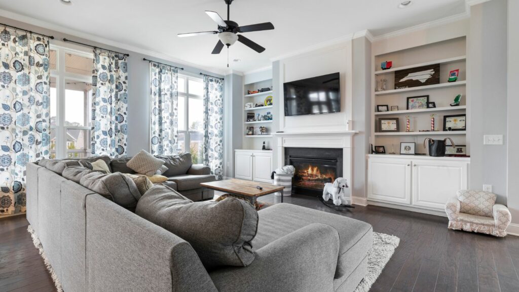
But not all whites are created equal. Warm whites (with hints of yellow or beige) make a room feel cosy and inviting, while cool whites (with blue or grey undertones) lend a crisp, modern feel. The trick is to match your undertone to the natural light your room receives.
- North-facing rooms tend to have cooler light, so warmer neutrals help balance that.
- South-facing rooms are flooded with warm sunlight, so cooler tones can keep things feeling fresh and balanced.
- East- and west-facing rooms change throughout the day, so go for a neutral mid-tone that doesn’t shift too dramatically.
Once you’ve got your base, you can build depth and personality through accent colours.
Use Contrast Strategically
While pale tones open up a space, a completely white room can feel flat or sterile. The secret to keeping it lively is using contrast — but carefully.
For example, painting your skirting boards, door frames, or window trims in a slightly darker tone adds dimension without breaking the sense of flow. The contrast helps define boundaries subtly, making surfaces appear further apart and, therefore, the room feel larger.
Similarly, accent walls or darker furniture can provide grounding. Try pairing pale walls with a charcoal sofa, navy rug, or timber feature wall. This balance between light and dark adds sophistication while maintaining that spacious illusion.
The Magic of Cool Tones
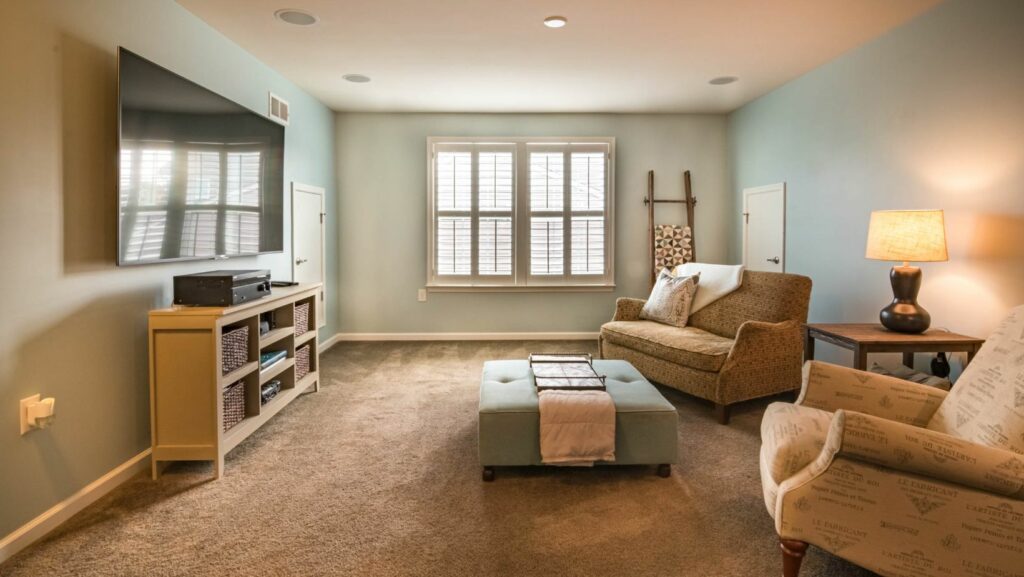
Cool colours — such as soft blues, gentle greens, and pale greys — tend to recede visually, making walls seem to “push back.” This creates a feeling of depth and calm, making rooms appear larger than they actually are.
A powder blue bedroom, for instance, feels serene and open, while a pale sage kitchen evokes freshness and space. These tones also work beautifully in Australian homes, where natural light can be harsh. Cool colours help soften sunlight and make interiors feel soothing even on the brightest days.
For a cohesive look, carry your chosen tone through the decor — cushions, art, ceramics, and fabrics — to tie everything together. When your eyes can travel around a room without interruption, the space feels unified and expansive.
The Ceiling Trick
Ceilings are often called the “fifth wall” for good reason — they dramatically affect how spacious a room feels. Most people default to painting them white, but you can do better than that.
A lighter ceiling colour than your walls instantly creates a sense of height, making the space feel airier. But if you want to get creative, try using a barely-there tint of your wall colour for a seamless transition. For example, if your walls are soft grey, use a lighter shade of the same hue on the ceiling to make it appear higher without feeling disconnected.
In some cases, extending your wall colour onto the ceiling — especially in small rooms — can actually make the space feel larger by removing visual boundaries. This works best with pale, muted colours rather than dark or saturated ones.
Flooring That Flows
One of the most overlooked elements in making a room feel bigger is the flooring. Consistent flooring throughout your home — rather than different materials or colours in each room — creates a sense of flow and unity. It tricks the eye into perceiving one continuous expanse rather than a collection of smaller spaces.
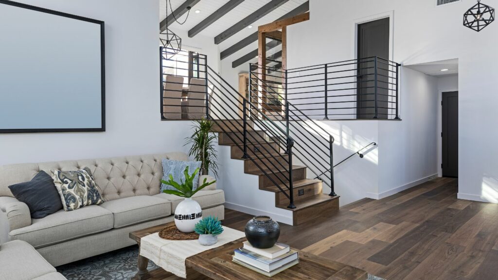
Lighter flooring tones, such as blonde timber, pale grey tiles, or whitewashed finishes, are ideal for amplifying light. If replacing flooring isn’t an option, a large neutral rug can achieve a similar effect by visually connecting the space.
When it comes to sheen, matte finishes tend to absorb light and look softer, while satin or semi-gloss finishes reflect light and enhance brightness. Choosing the right balance depends on your style — but for smaller rooms, a slightly reflective finish can work wonders.
Harness Natural Light
Even the best colour palette can’t work its magic without good lighting. Natural light is the ultimate space-enhancer — and the colours you choose should complement, not compete with, it.
If you’re lucky enough to have large windows, maximise them. Keep window coverings light and airy — sheer curtains, linen drapes, or simple roller blinds allow sunlight to filter through while maintaining privacy. Avoid heavy fabrics or dark colours that block out precious daylight.
For rooms that lack natural light, create the illusion of it. Mirrors strategically placed opposite windows bounce light around the room, while metallic or glass accents subtly reflect brightness. Pair your light wall colours with warm artificial lighting to maintain a welcoming atmosphere in the evenings.
Add Colour Through Texture
Making a room feel brighter isn’t just about paint — it’s about how light interacts with surfaces. Glossy, reflective materials naturally enhance brightness, while textured or matte finishes absorb light and create a more subdued feel.
Mixing these finishes adds visual depth. Think glossy tiles paired with matte cabinetry, or a high-sheen coffee table surrounded by soft, textured fabrics. This interplay of reflection and absorption helps light move through a space more dynamically.
Natural textures like jute, rattan, and linen also complement light colour palettes beautifully, adding warmth and preventing pale rooms from feeling too clinical.
Don’t Forget Colour Flow
To make your entire home feel bigger, aim for colour continuity between rooms. When colours shift too drastically from one area to the next, the space feels fragmented.
That doesn’t mean every room has to be the same shade — but staying within the same tonal family (for instance, soft greys and muted blues, or warm creams and dusty pinks) creates visual harmony.
You can also use variations of a single hue — lighter in small or darker rooms, deeper in larger ones — to keep a cohesive flow that still feels interesting.
Embrace the Light, Not Just the White
While white is often the go-to colour for brightening a space, it’s not the only option — and sometimes, it’s not even the best one. In very bright, sun-drenched rooms, pure white can feel harsh or sterile. In darker rooms, it can look dull or greyish.
Soft pastels, muted earthy tones, and delicate neutrals can achieve the same sense of openness while adding warmth and personality. Think of colours like clay beige, misty aqua, or blush-tinted cream — all of which bring life and depth without closing in the space.
Creating the illusion of space isn’t about tricks or gimmicks — it’s about understanding how colour and light work together. By choosing hues that reflect light, maintaining visual flow, and layering texture thoughtfully, you can turn even the smallest room into one that feels spacious, bright, and inviting.
Because when colour is chosen with intention, it doesn’t just change how your home looks — it changes how it feels. And that’s the real magic behind a truly well-designed space.